

Brand evolution: redefining and executing a new visual identity.
Brief: Unite three entities under the one identity. Formerly Richmond Fellowship Tasmania (RFT) and its subsidiary Richmond Futures Ltd and investment arm, Richmond Investments Tasmania (RIT).
Approach: Bring brand elements of three different entities together by paying homage to the current RFT identity which has been visible in the Tasmanian community for 10 years and bring elements of Richmond Futures into the new brand symbol with a nod to the RIT colour scheme.


Clear brand communication.
Brand Symbol Rationale: To create a brand symbol that communicates a sense of momentum – moving forward, stepping out into positive possibilities, stepping up into a different space or place. A symbol that communicates joyfulness, inspiration, inclusion and reflects a multi-faceted individual taking control of their life.
Brand and Positioning Statement: Despite RFT providing community-based mental health services for 40 years across Tasmanian, very few people understood what they offered. Coming up with a succinct statement and incorporating it into the new branding was my solution to clearly communicate what Richmond Futures is about.

People focused design.
A new website: Becoming one organisation meant bringing all mental health programs and NDIS independent living options together on one website.
The new site is designed for the participant, their family or carer and for professionals Richmond Futures work with, and now represents a single brand and channel in the community.

New website
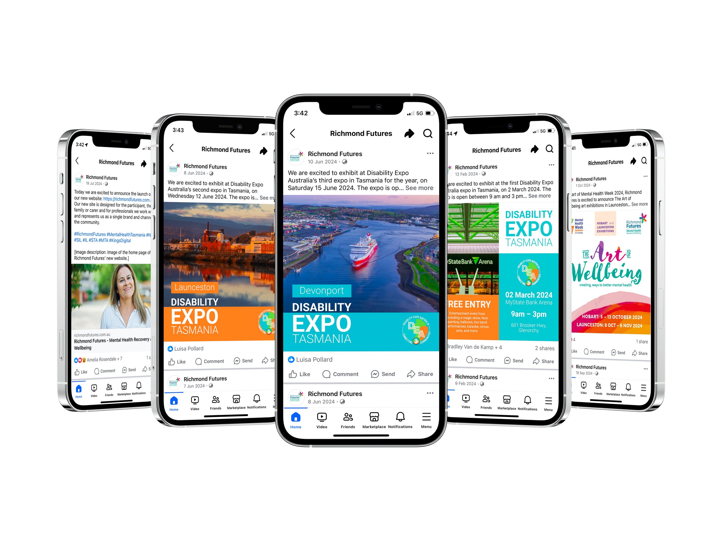
Social media
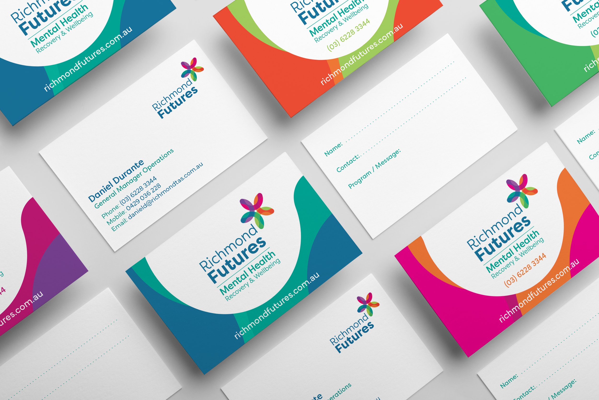
Executive and generic program business cards
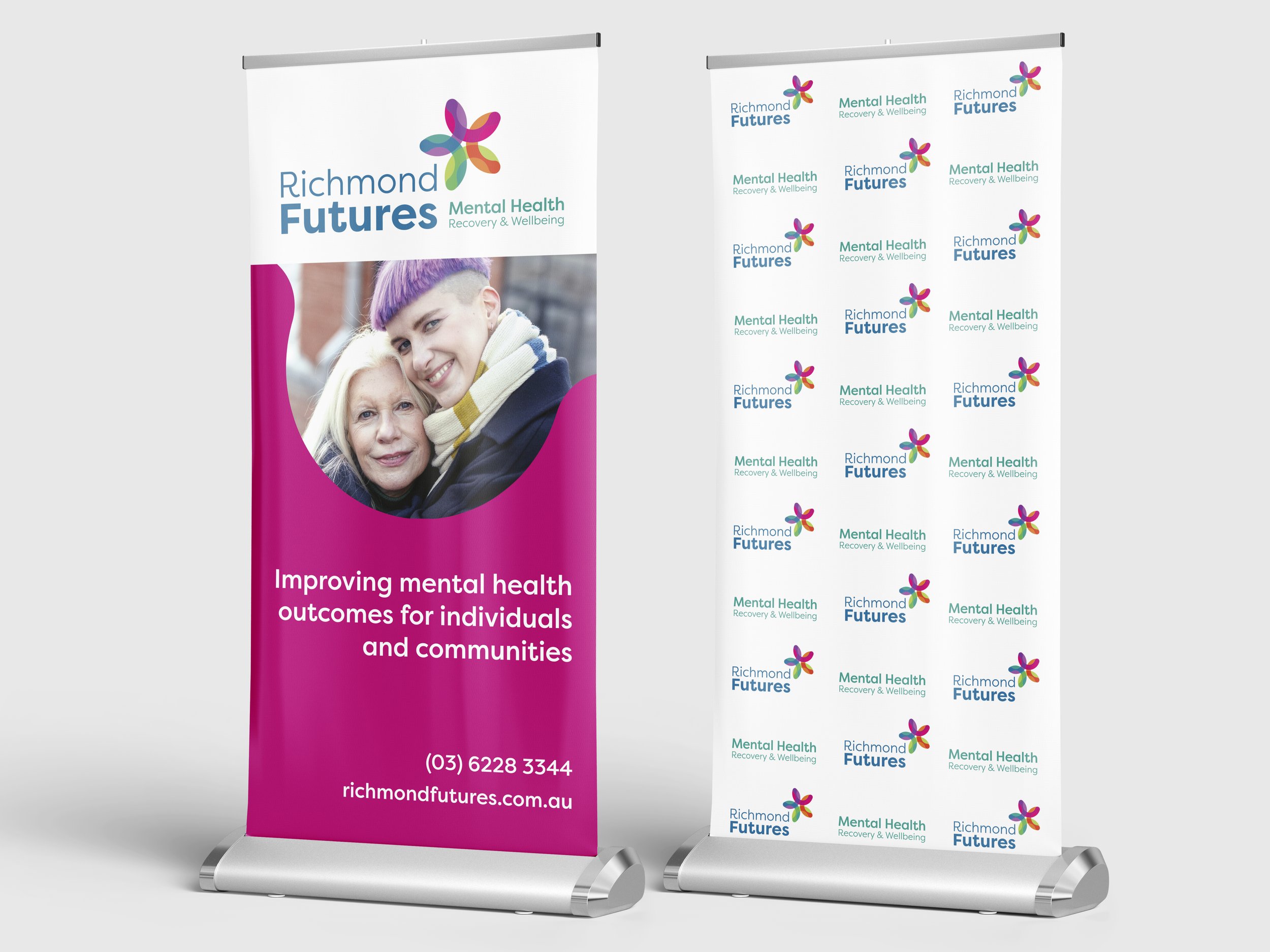
Roll-up banners
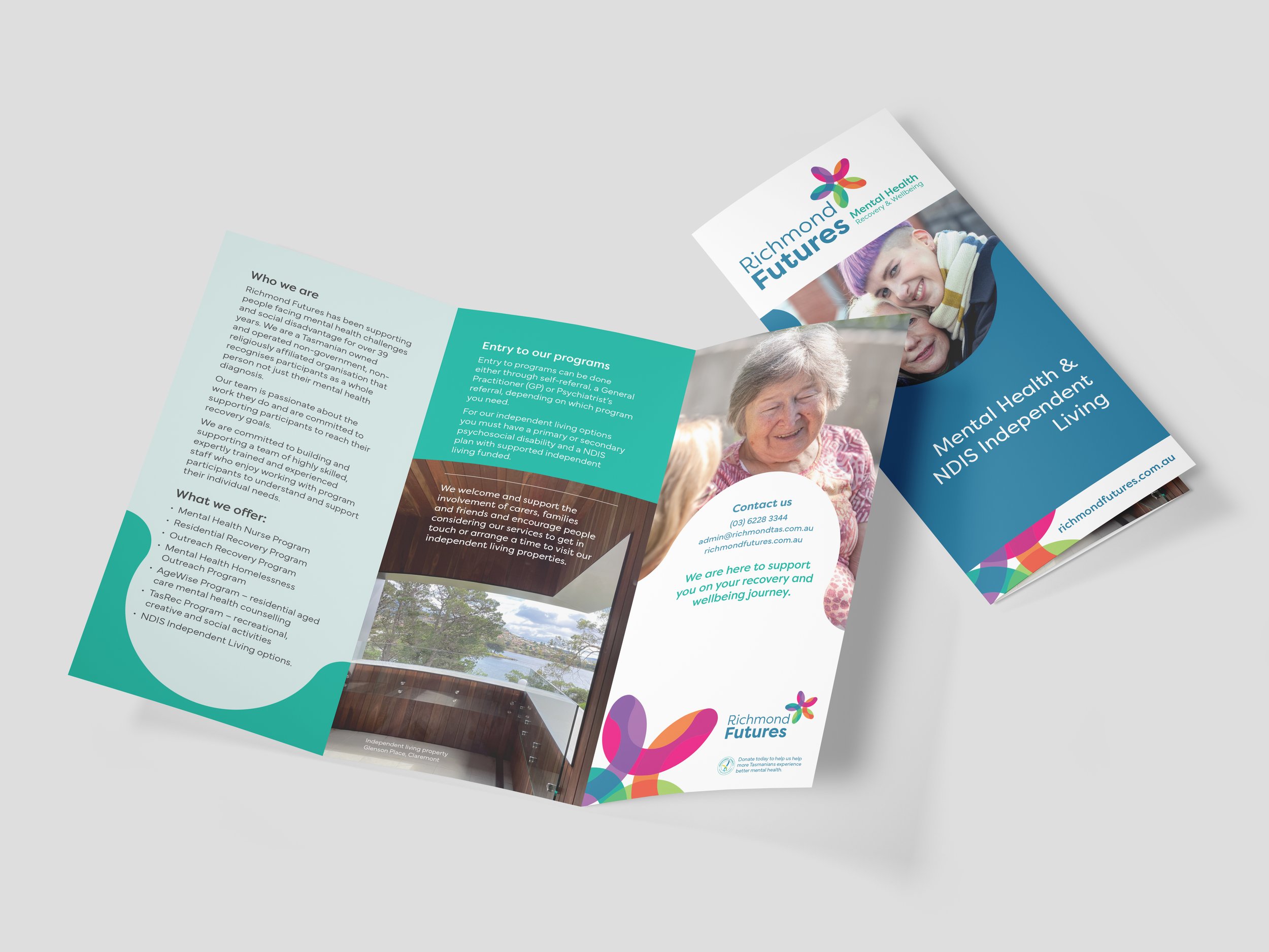
General information brochure
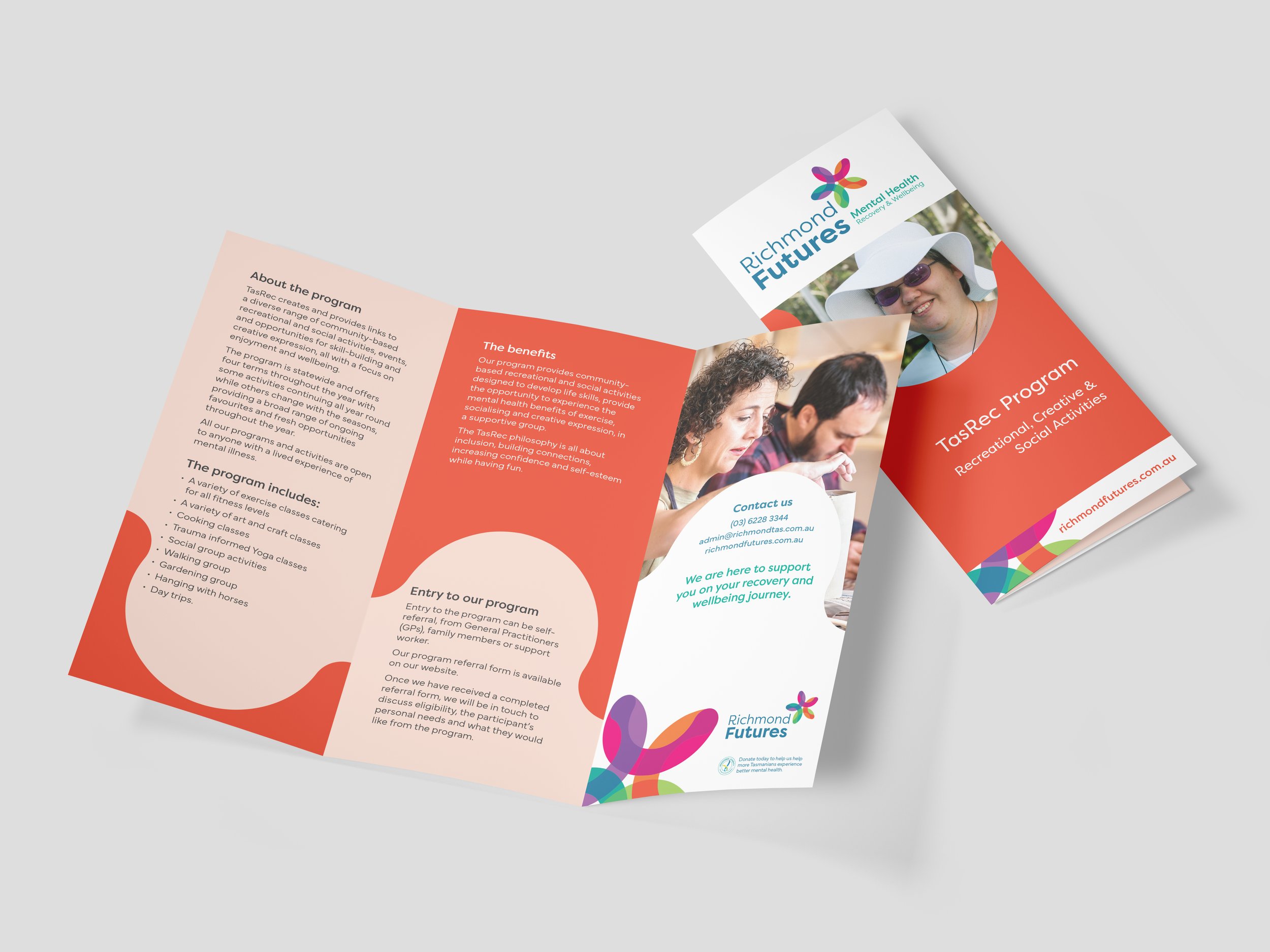
TasRec program brochure
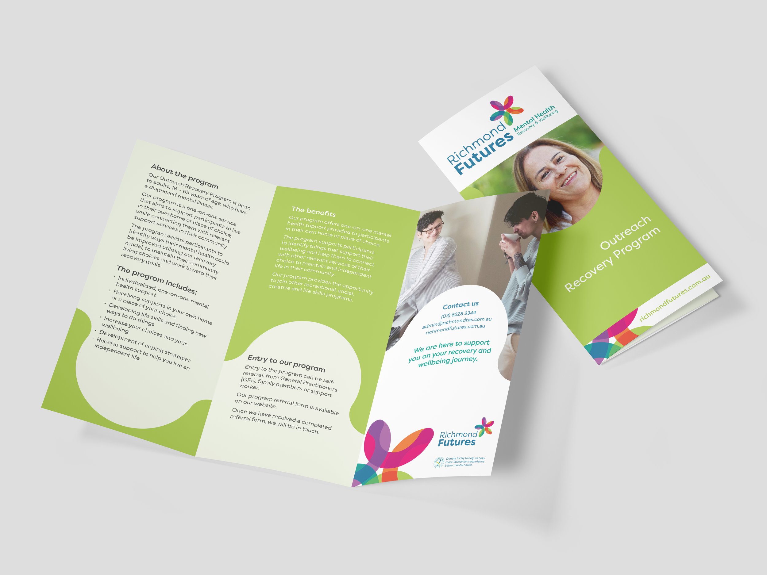
Outreach recovery program brochure
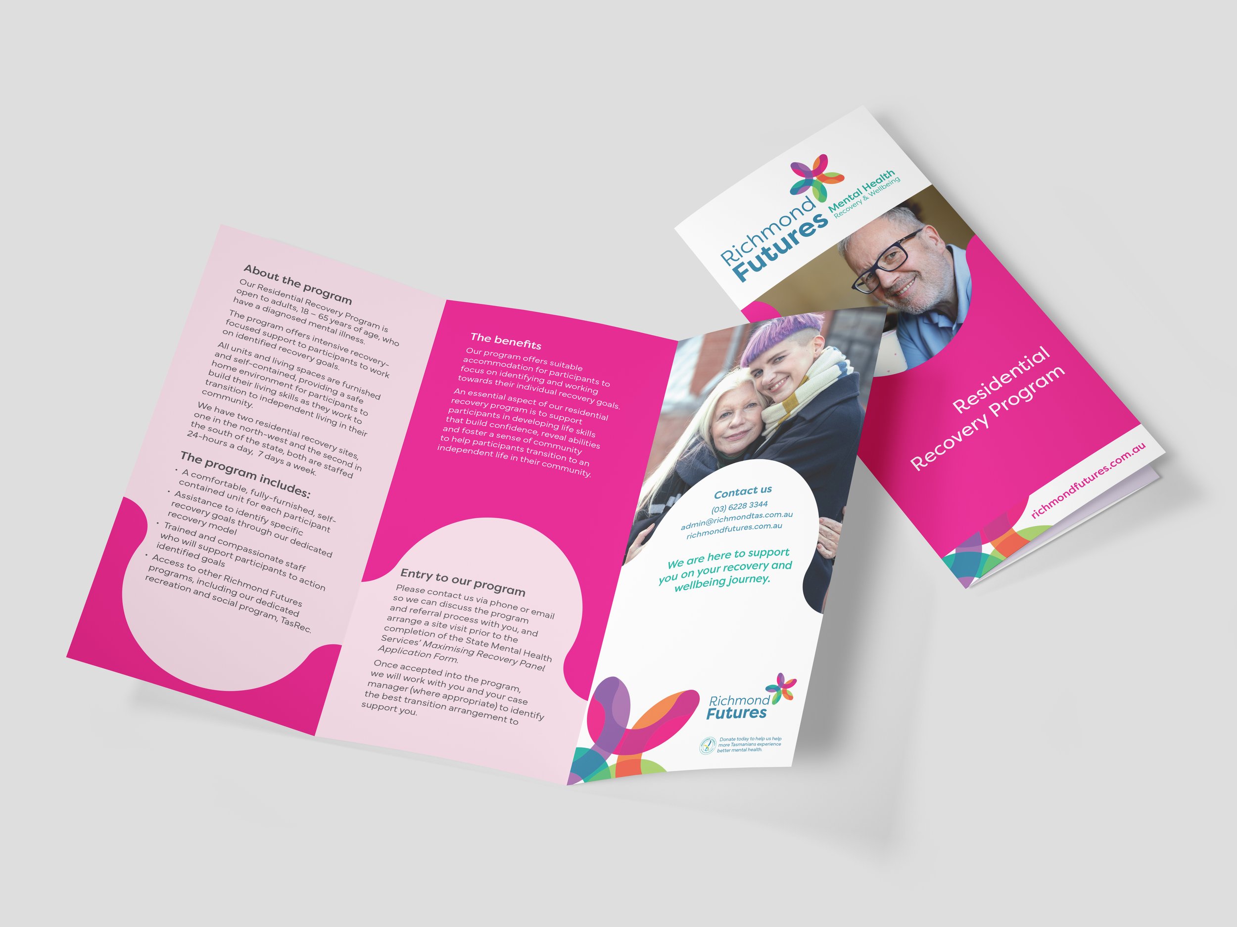
Residential recovery program brochure
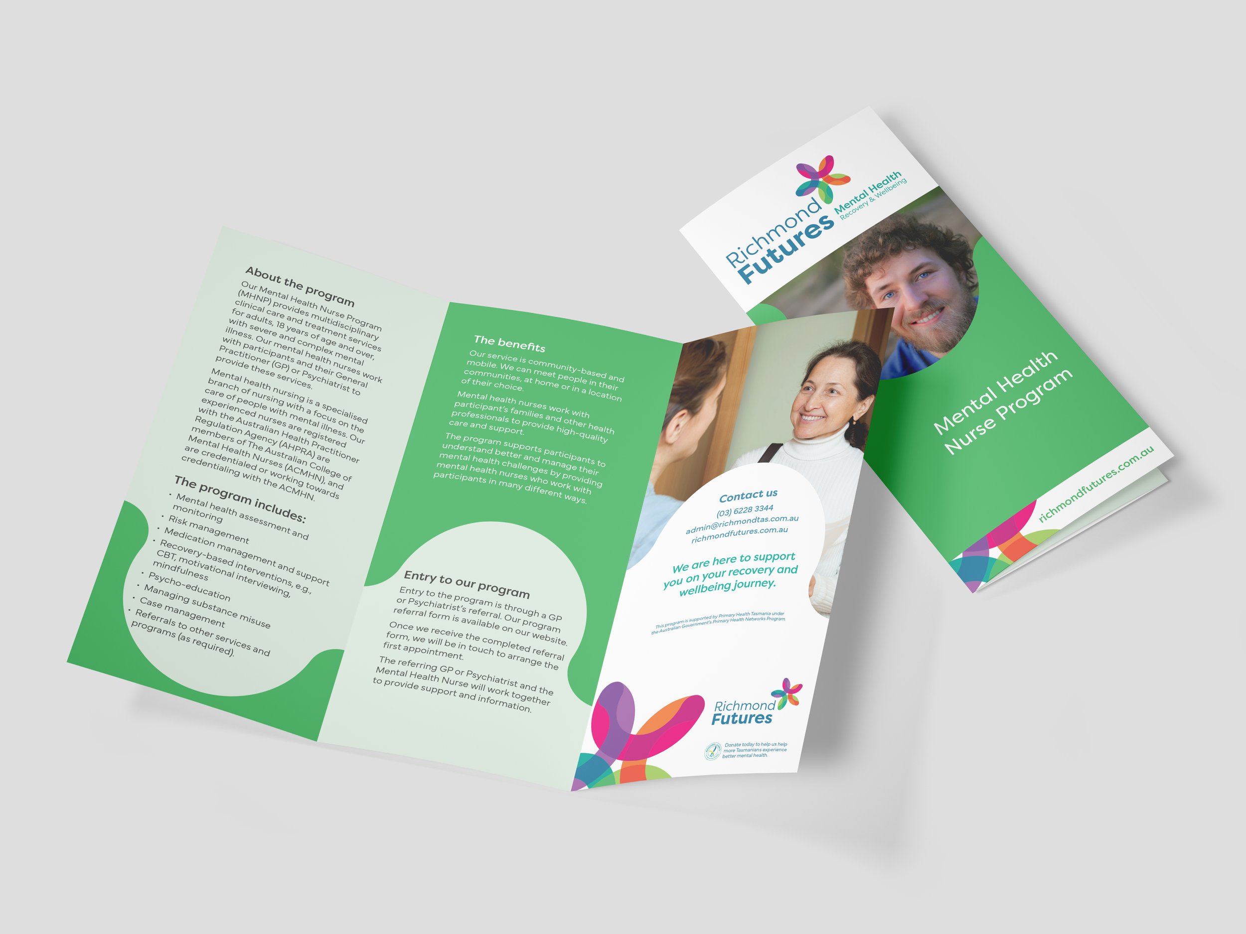
Mental Health Nurse program brochure
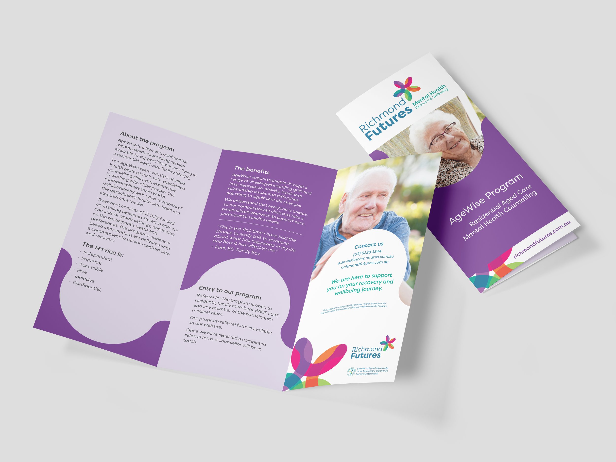
AgeWise program brochure
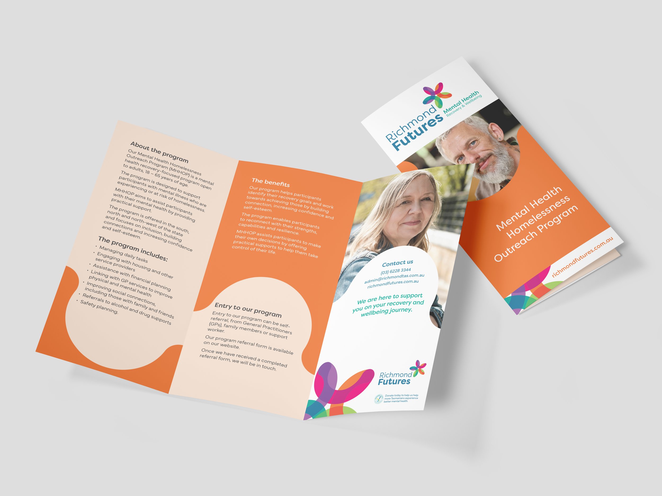
Mental Health Homelessness Outreach program brochure

Independent Living property guides
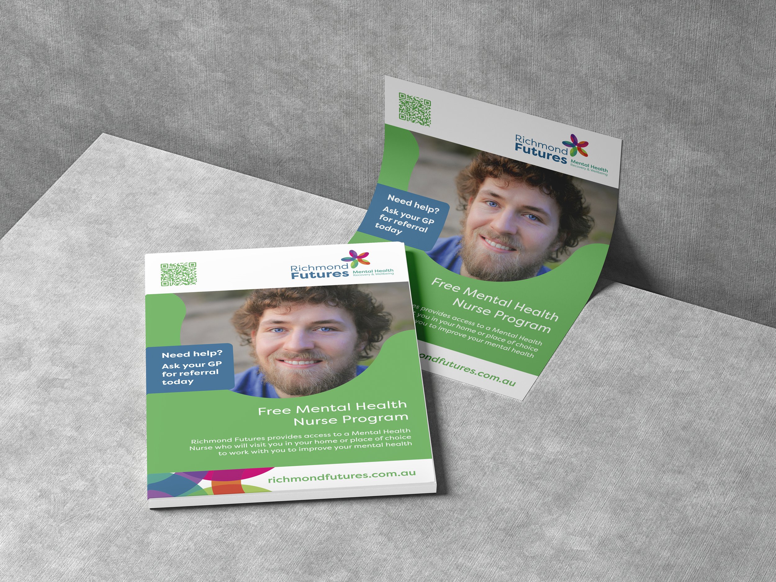
Mental Health Nurse Program poster for medical centres
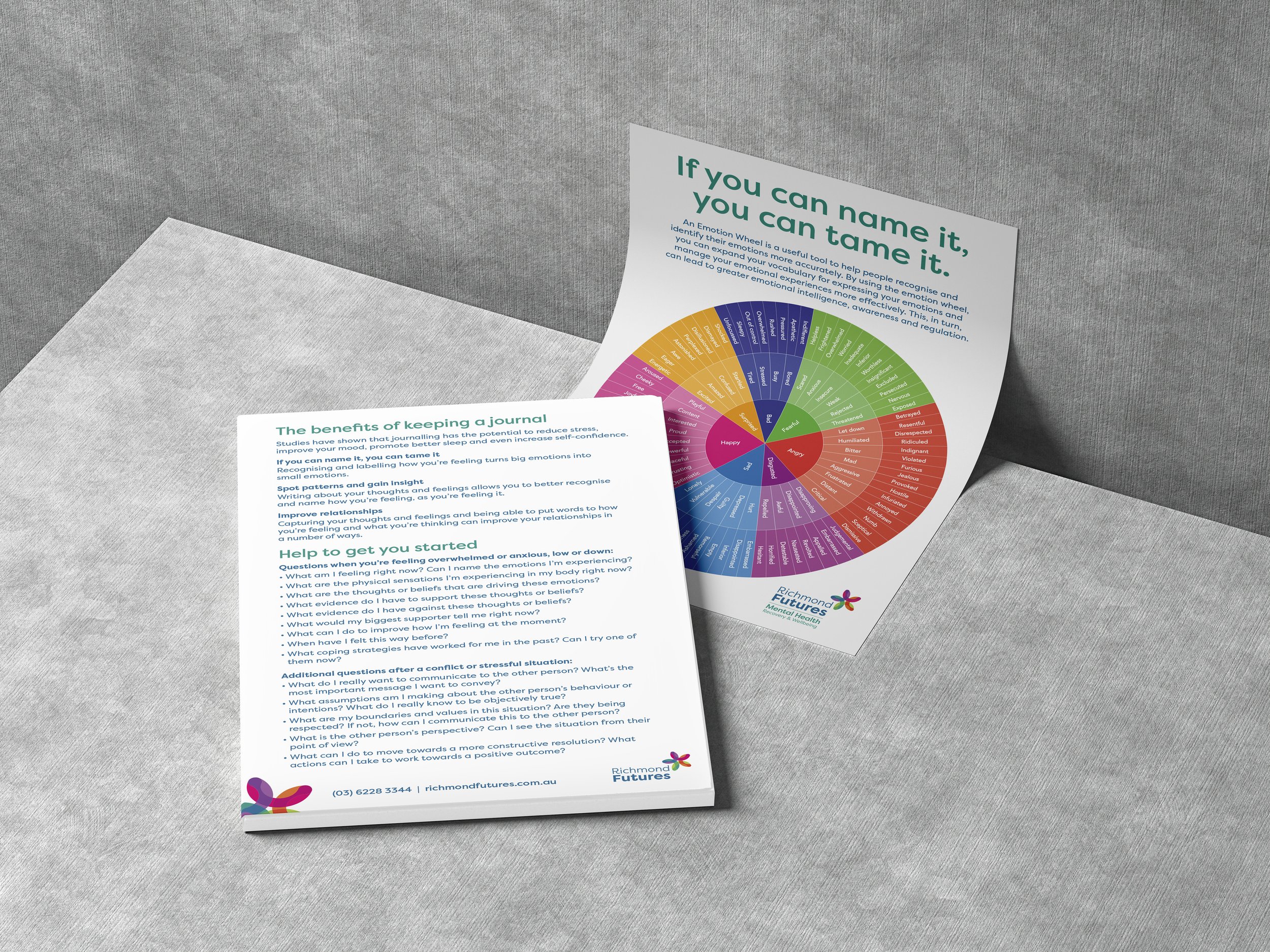
Expo promotional item: A5 emotion wheel and journaling card
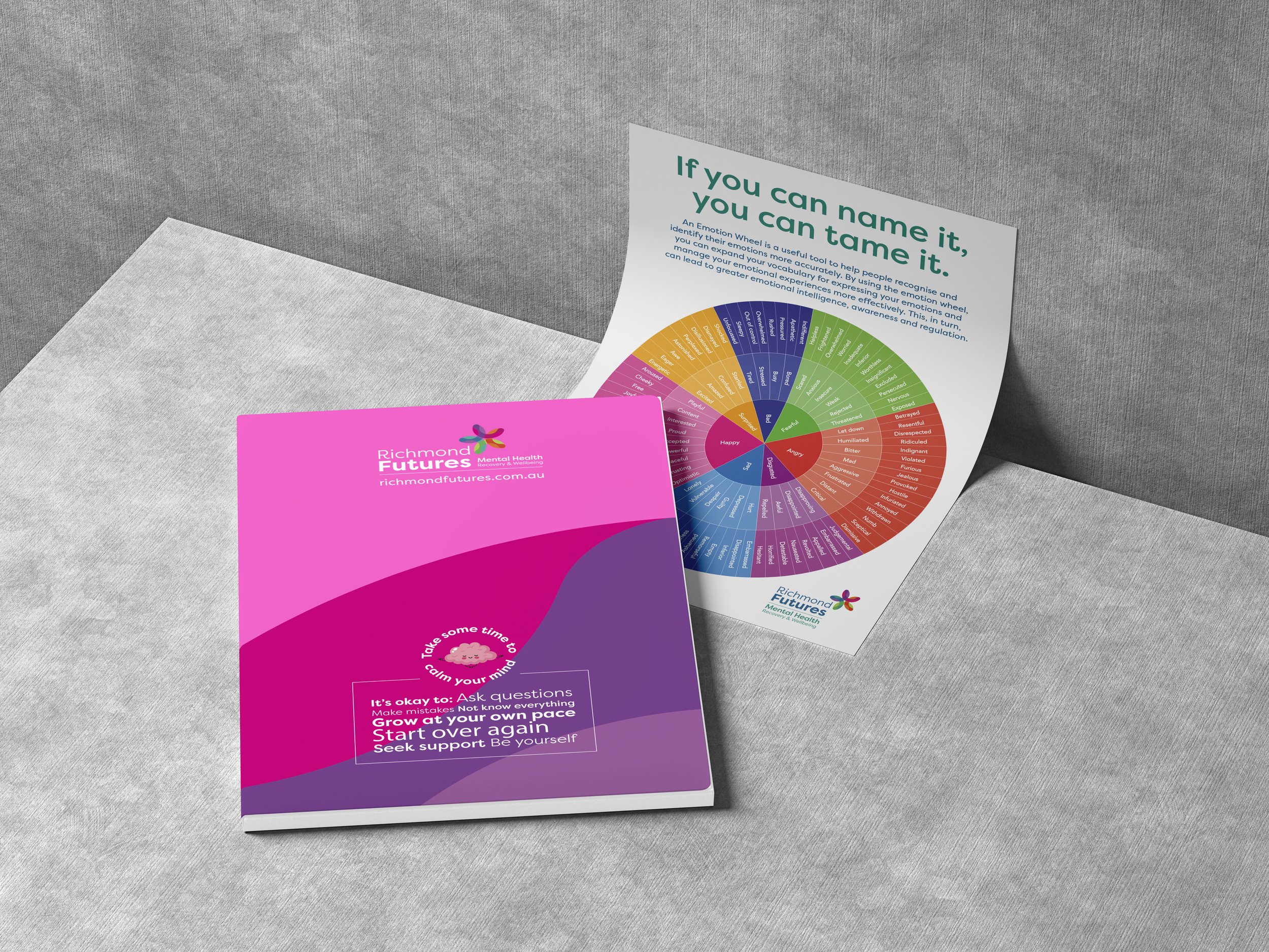
Expo promotional item: A5 notebook with emotion wheel and journaling card
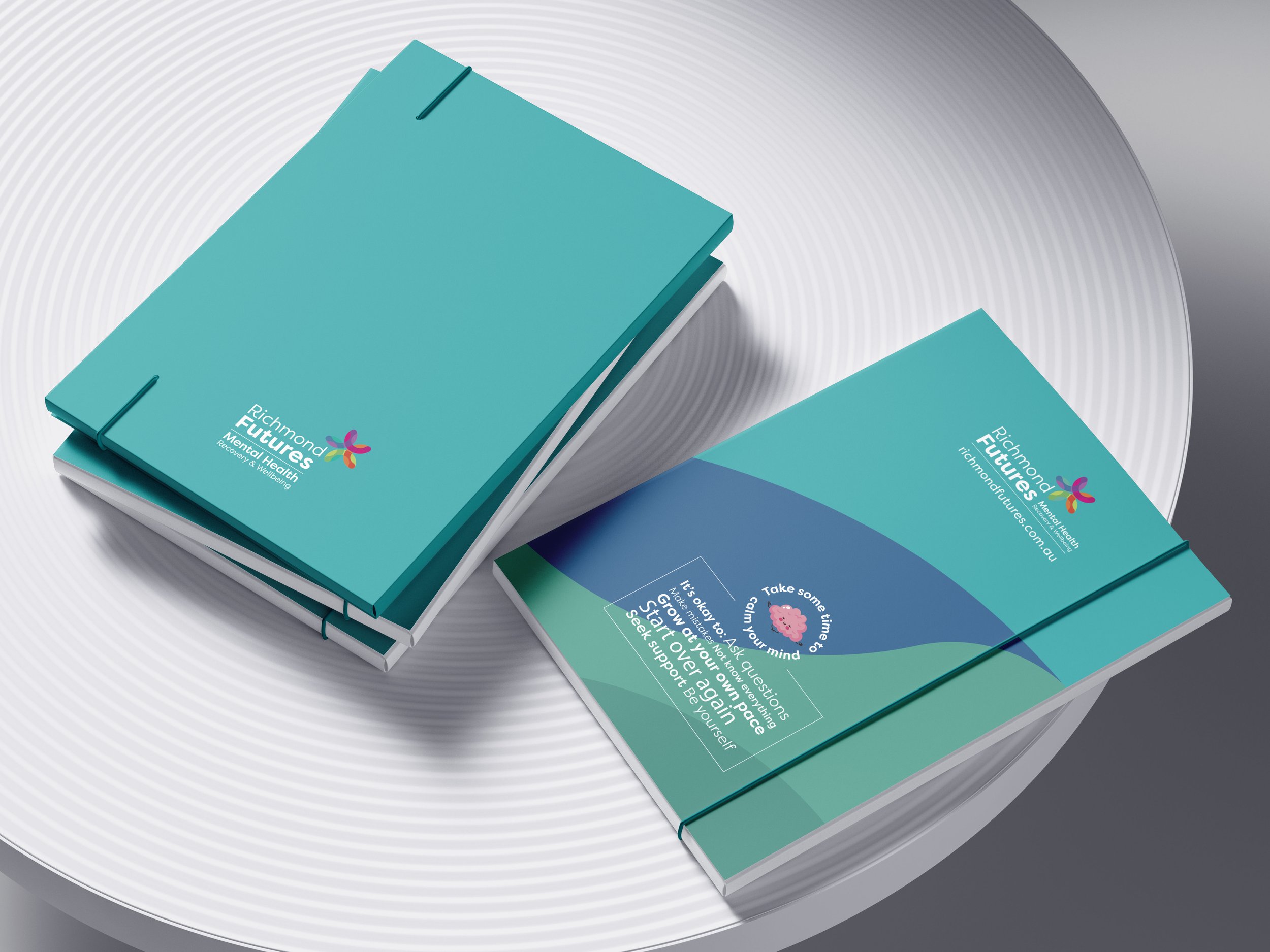
Expo promotional item: A5 notebook concept
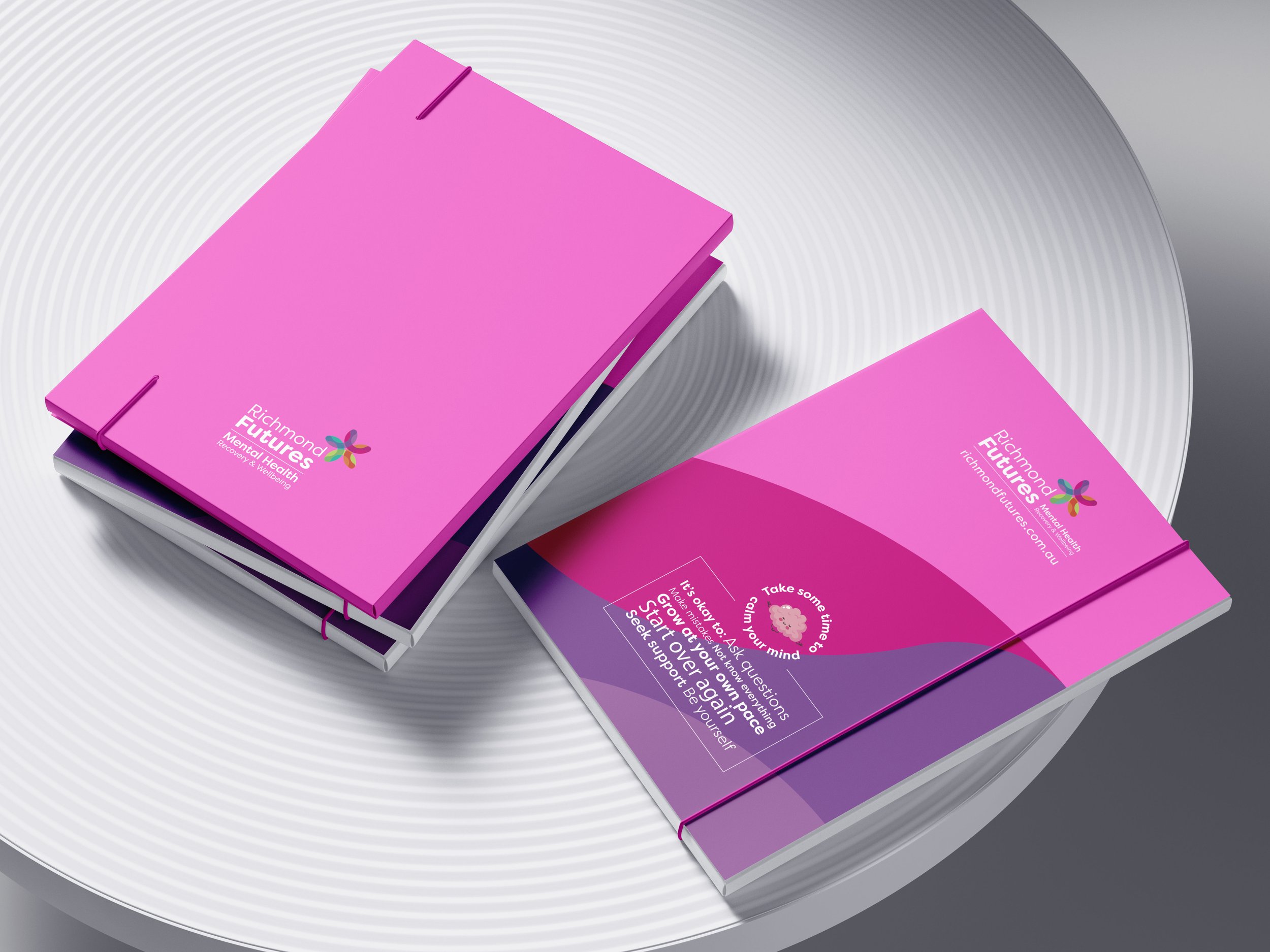
Expo promotional item: A5 notebook concept
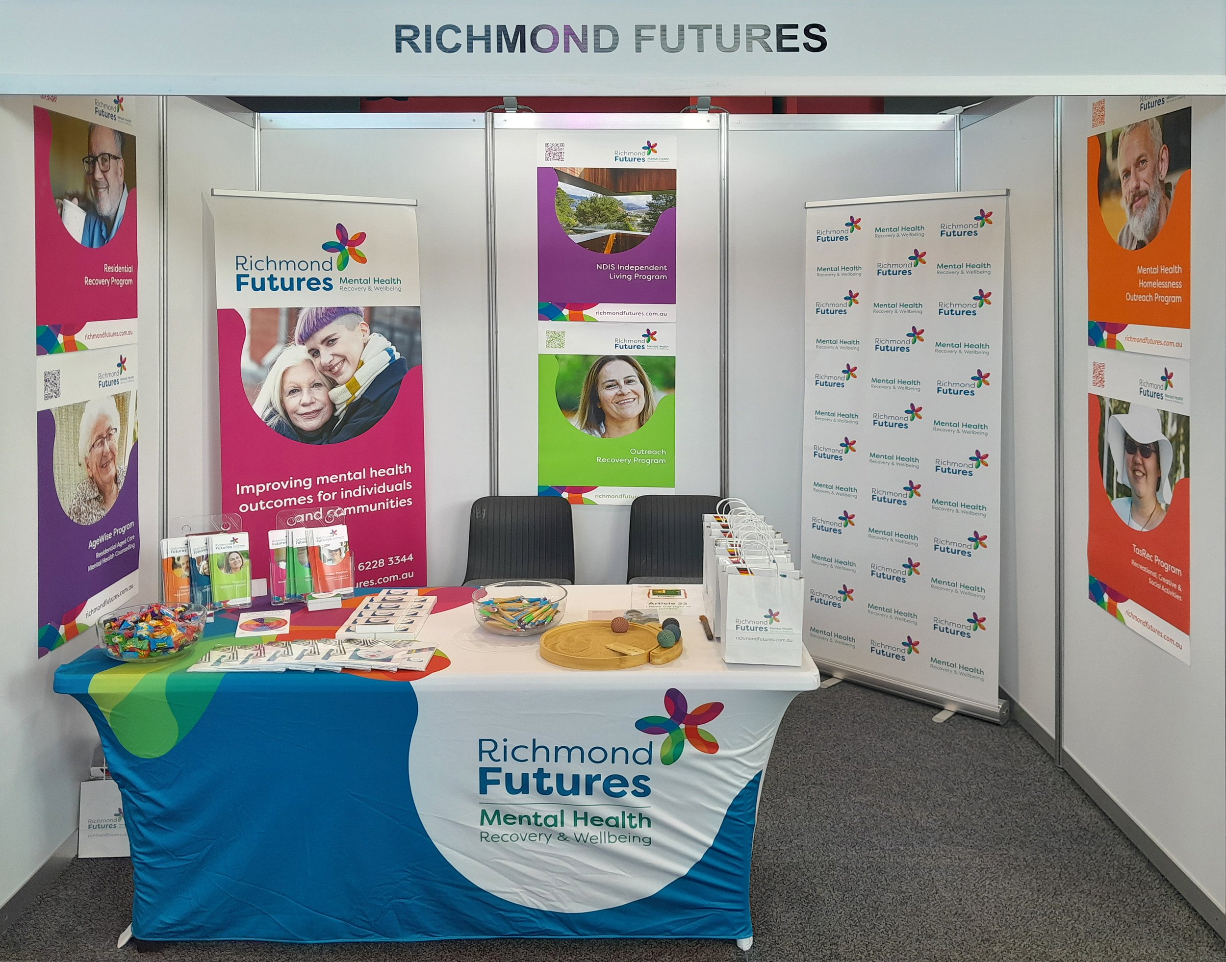
Expo booth & promotional items
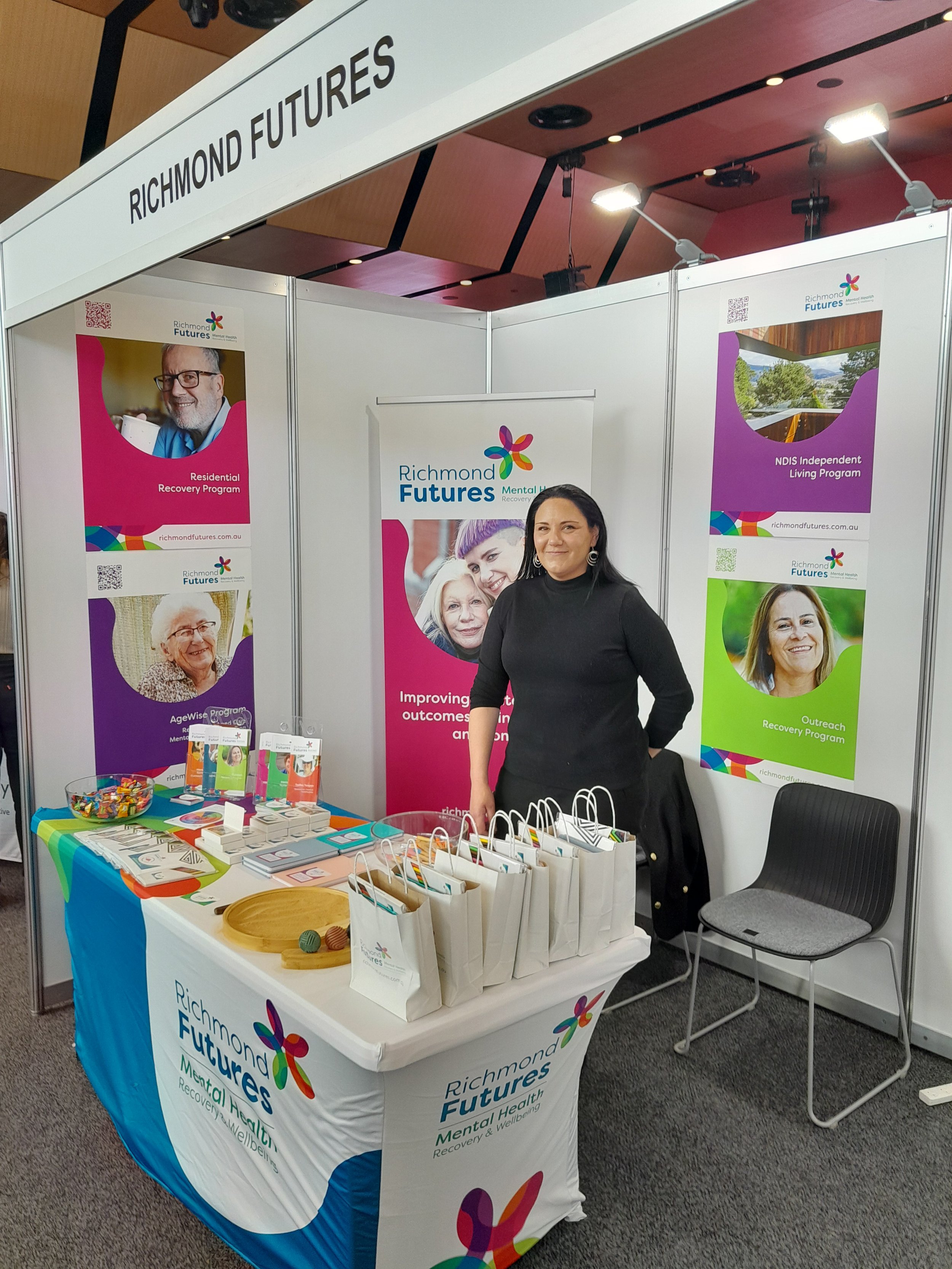
Expo booth & promotional items
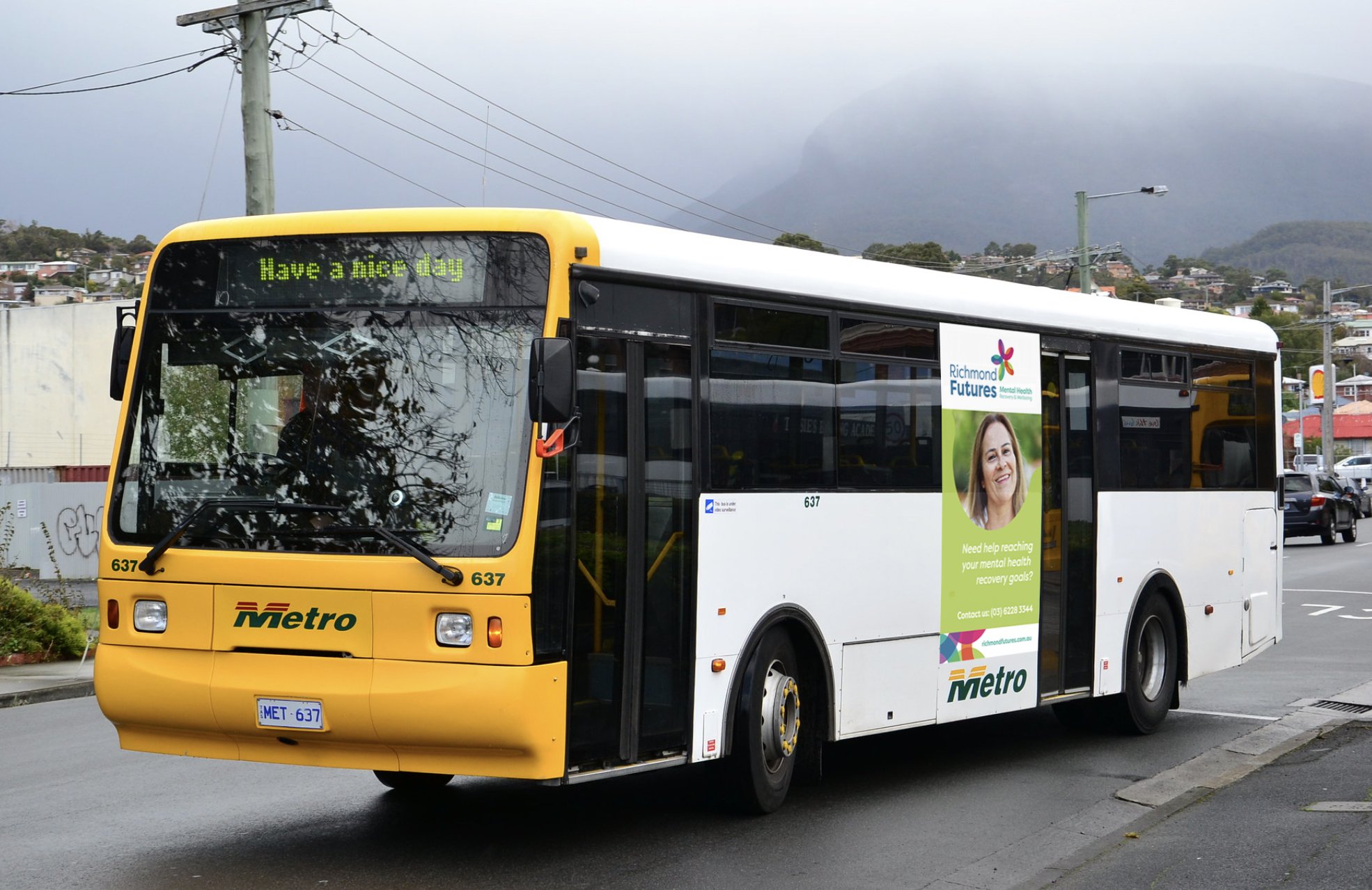
Brand awareness campaign concept